This is a basic primer with hints on technique as I have worked it out for myself and through teaching others.
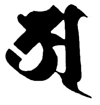
I've used a grid here because I think it helps you to get the hang of the proportions - which is what most people struggle with. However once you find you can do the character try it without the grid. The point is not to perfectly reproduce the character each time, because each time you write it will be unique in any case, but to understand how the various parts of the character work together to produce an aesthetically pleasing effect.
On the other hand the idea that you write in order to express your individual talent is an anathema to the Buddhist tradition - the self is an illusion and 'self' expression doubly so. The idea is that by writing 'a' you try to capture the unfathomable mystery of śunyata.
I use standard calligraphy pens. Felt tipped pens are cheap and can be found in most art or stationery shops. I've also used paint brushes with both ink and acrylic paint. I use flat brushes rather than the chinese style round brushes so the characters look much like those written with a pen. But the characters can be written in any number of styles so feel free to experiment!
More information on the 'a' seed syllable
Basic Strokes
 |
The height and width of the grid are four times the width of your pen or brush. Calligraphy pens have a long flat nib, which should be aligned at a 45° from top left to bottom right. This should be maintained while writing the character. Hold the pen or brush close to vertical. |
 |
The comma shape is about 2 pen widths long, and about 1 wide. |
 |
The wave is about 2 pen widths long, and goes up by about half a pen width. |
 |
The diagonal is on the 45° angle still, and is about four pen widths long. Either side of the blue line should be of equal length. |
 |
The hook should be nice and rounded. It should meet the diagonal at the half way point, and it should the same height as the rest of the figure. Stevens says to start at the mid point of the diagonal and clockwise around to the end of the diagonal. I find that the character flows better doing it the other way, ie anticlockwise. The clockwise direction may be related to the ancient practice of circumambulating a revered person or object, such as a stupa, in the clockwise direction. So from a traditional point of view this may not be a minor point! |
 |
This comma is the same dimensions as the first one, only the direction is different. |
 |
The vertical starts just off line and bends into place, just touching the rest of the character (or even overlapping a little), then proceeding vertically. |
 |
This last stroke is same as the first one. However in many examples you will see that some calligraphers make it quite a lot flatter than this. I'm not sure which is 'right' and can aesthetic advantages to both. So it's your choice. |
Video
Some common difficulties
When you start you may find that your seed syllables don't look like the ones you are copying. Part of the practice of writing seed syllables is closely observing the results. Spend some time contemplating each character and especially at the beginning comparing it to the one you are copying. Pay attention to the differences between them.
There are two basic kinds of difficulties that most people find.
- The angle of the pen. Keep the flat edge of your pen on a 45 degree angle. If you are too flat, or too steep, you will find that your character is not well proportioned.
- The proportions of the character are determined by the size of your pen or brush. If you are making your lines too long, or too short, your character will be too splindly or too squat.
If you have spent some time looking at your work and can't see where you've gone wrong, try comparing it to the examples below which may help you work it out.
 |
 |
 |
 |
Too flat |
Too steep |
Too long |
Too small |
You should now have enough information to be able to get on and start doing your own work. A lot more information is found in John Stevens' book Sacred Calligraphy of the East. The Omniglot Siddham page also has useful information.
The book of the
Visible Mantra Website
now on sale

Calligraphy Tools

An Eddings 1255 5.0mm calligraphy pen. Good for beginners, cheap, but the nibs wear out after a while.

A Pilot Parallel Pen more expensive, but nibs last for ever. Comes in 1.5, 2.4, 3.8, & 6.0mm

A flat paint brush, using calligraphy ink. Good for working on a larger scale.

Foam brushes are cheap and handy for big letters. They come in a variety of sizes. Best with thin inks.
Last updated: 08:39 29/01/2009