If you have not tried Siddhāṃ calligraphy before then I recommend starting with the a syllable. The hūṃ is a little more complex and difficult. Even if you feel you must start with hūṃ, please read the introductory remarks on the a syllable page. Thanks.
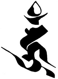
You will see that the grid for hūṃ is quite different from a. The centre of gravity of the character is to the right of centre and towards the bottom, where as a is almost symmetrical. This gives the hūṃ a more dynamic quality, the large hook on the left seems to lead off somewhere, and the crown of the anusvāra gives it a regal look. Remember that the grid is a bit arbitrary and that you should use it to get a feel for the proportions and then start writing freehand - if you feel confident then there is no reason to use the grid.
More information about the seed syllable hūṃ
Basic Strokes

This grid is six pen width's wide - and 9 high |

The first stroke is a comma shape - 1 pen width wide, and 2 long. |

The head of a hūṃ is wider than for an 'a' - about 3 pen widths. |

This diagonal runs straight down on a 45° angle, and then curves downwards right at the end. This is what I call the 'head' of the character (which in Devanāgarī becomes a horizontal line). |

This arch is more or less parallel with the previous long diagonal. Notice that is sits underneath the head of the character, and doesn't go far beyond a vertical line drawn down from the right-hand edge it. The tail of the curve is on a 45° angle. At this stage the character is a complete 'ha' |

The hook is quite difficult to master. It starts as a tight spiral until it joins the body of the character, and then it broadens out into a rounded circle until the bottom of the arc, and then flares off into space. It is critical to keep the angle of your nib at 45° for this stroke to look right. This stroke modifies the vowel sound so that the character now reads 'hu' |

This little stroke is a comma shape, which should be familiar by now. The effect of this is to lengthen the vowel to a ū so that the character now reads hū |

The more ceremonial anusvāra has two parts. This stroke is, like all the rest executed with the pen nib at 45°, the upper points should be about level with each other, and the over all width should be the same as the head of the character. |

For the final stroke, hold the pen with the nib on a 45° angel, with the lower edge (ie the left end of the nib) on the centre line. Draw the pen up one pen width, so that the shape is a square standing on one point. |
Video
Last updated: 08:02 29/01/2009